


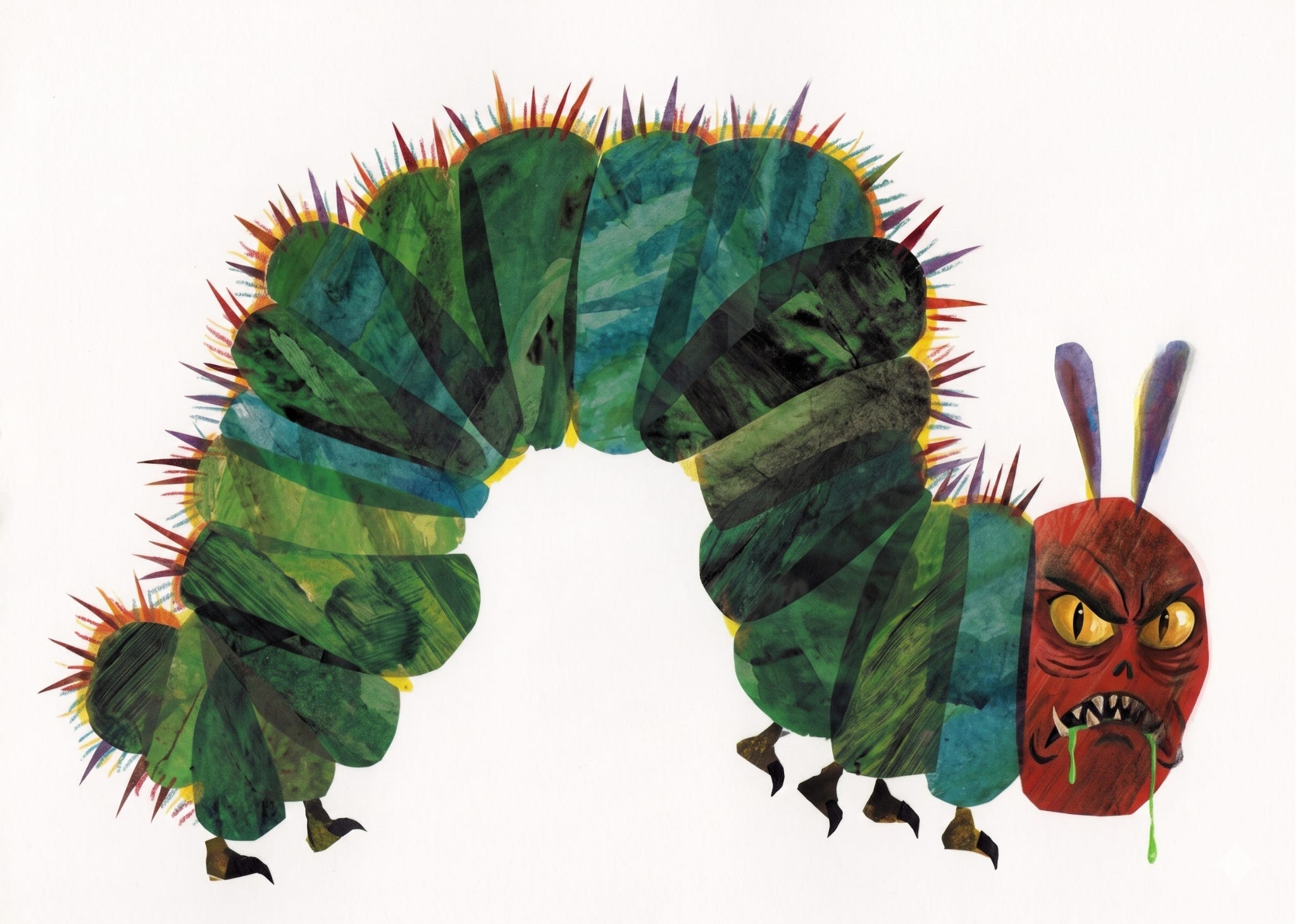
You’re in the library with your three-year-old. He picks up a book from the shelf and brings it to you.
“The Very Naturalistic Yet Still Whimsical Caterpillar,” you say aloud. An anatomical illustration of the caterpillar — tentacles, head, true legs, spiracles, and prolegs clearly delineated — features on the front cover. You open to the first page.
“One Sunday morning, after two weeks of chewing through the hard outer shell of his egg, the caterpillar chewed a hole through the eggshell with its mandibles. It consumed the remainder of its protein-rich eggshell and then slinked away, whimsically, to forage plant leaves, stems, and flowers.”
End scene.
Eric Carle’s “The Very Hungry Caterpillar” (TVHC) has been the subject of aesthetic discourse on X in recent days. (To preempt the accusations that I’m taking children’s literature too seriously: Yes, that is what I do. See here.)
The commotion kicked off with a tweet from Megha Lillywhite.
“Instead of getting the Hungry Caterpillar for my children I got ‘A Butterfly is Patient’. Why? Because children deserve beauty rather than ugliness. It nourishes their spirit in a healthy way. Ugly art is junk food poison for your children. You were told to get Hungry Caterpillar by an insalubrious culture. Resist. Get your children books that depict nature in its true resplendent beauty in anatomically correct images that will help them identify things like caterpillars and butterflies in the real world. This is what they deserve. Let the blobby artists starve on their own egos.”
I agree that one should give their children beautiful things. I agree that certain art is bad and ugly.
I do not agree that TVCH is poisonous art. Furthermore, it is a poor example of “blobby” art. “Blobby” conjures wastelands of Corporate Memphis and that 12-foot-tall bronze statue of a fat black woman standing in Times Square with a defiant hand on her hip.

Lillywhite begins by arguing that beautiful art serves a spiritual purpose. She later suggests beautiful art must be naturalistic — “anatomically correct images” — and that naturalism serves a more material purpose: Helping your child associate representations of reality with reality itself.
But if one looks at children’s drawings, one can see that they reproduce reality in questionable ways.
“It’s a beautiful picture, honey. Is that a … dog?”
“No, it’s you, mommy.”
That’s not to say that literature meant for children should be illustrated in the style of a child. It’s only to say that I’m not sure naturalistic art is the primary method by which children learn to identify objects in the world around them.
Lillywhite sketches an initial definition of beauty: Mimesis. Images are worth more if they closely approximate the physical world, and worth less if they do not.
Lillywhite remarks in another tweet: “Realism is beautiful and valuable because a good artist who executes realism captures more than a photograph ever can. Photographs frankly don’t understand light the same way that the human eye does. Photographs flatten in a way that paint does not in the hands of a skilled artist.”
A hypothetical: If a device were invented which could instantly capture a scene with the same understanding as the human eye, would the images produced by that device be superior to naturalistic paintings?
I do agree with elements of Lilywhite’s appraisal of realism. The artist has a special power of vision — insight.
Or, as artist “owen cyclops” wrote in response to Lillywhite: “’[S]ight’ is not just light hitting your eyes, there is an inner form of sight that melds with the process of thinking. illustrators can operate anywhere on that spectrum: reproducing what the eye sees, or working in this inner spiritual sight.”


Anyhow, Lillywhite’s definition of art is more expansive than “realism is good,” as she explains in a follow-up post.
“I was never arguing for hyper-realism in art in this post as I’m being accused of doing. I was arguing for a basic respect for the source idea: the butterfly, with some fidelity to its beauty, symmetry, form and pattern. Carle’s work fails on several metrics of good design.”
This critique is a bit difficult to parse, because Lillywhite’s definitions are not entirely clear. What does “basic respect” mean? Do Salvador Dalí’s melting clocks respect the source idea? What of the odd architectural designs in Hieronymus Bosch’s “The Garden of Earthly Delights?”
Carle’s butterfly is recognizably a butterfly.
Lillywhite maintains that “[n]one of the shapes are good” and that Carle’s “butterflies in the shape of their wings, look cumbersome. Like it wouldn’t actually be able to fly. You can’t imagine it flitting through the air, it looks like a crumpled piece of paper.”
She argues the butterfly has “[n]o silhouette, no pattern, no articulation of precise line work in the wings, looks heavy and awkward rather than light and magical.”
Carle’s butterfly does not appear “heavy and awkward” to me. His rendering of a “big, fat caterpillar” does, quite intentionally. But the butterfly which emerges from the cocoon reminds me of the kaleidoscopic effect of light shining through stained glass panels. It has motion.
Lillywhite experimented with removing the color from TVHC: “You can tell the hungry caterpillar is ugly art because the allure disappears completely when you remove colour.”


Color is an important dimension of art. One does not see the “true” painting by stripping it of color.
Consider those artistic “reconstructions” of ancient Greek and Roman statues. A garish coat of paint changes one’s impression of Athena entirely.
Lillywhite elsewhere argues that Carle’s art “isn’t bad merely because it’s unrealistic but because its objectively ugly design.”
This does not help us very much. What about the design is objectively ugly? I could point to principles of design which TVHC fulfills. It has a rhythm, achieved by repetition. It plays with proportion — the tiny caterpillar tunneling through giant berries. The collage style gives the depictions of animals, food, and plant life some depth and texture.
Lillywhite has many other tweets expounding on her artistic philosophy, but I feel I’ve included a representative sample here.
In matters of taste there can be no dispute, and yet, I dispute. Design principles and color theory are useful inroads of analysis, but to some extent, they serve to justify our preexisting impressions.
“I like ‘The Very Hungry Caterpillar,’ so it has good design.”
“I do not like ‘The Very Hungry Caterpillar,’ so it has bad design.”
I was not particularly fond of or repulsed by TVHC as a child. I was obsessed with “D’Aulaires Book of Greek Myths.” I think I slept with it in my bed for more than a few nights. The illustrations are not naturalistic. They are colorful and often detailed and composed in varied and delightful ways.
My appraisal, as an adult: I think TVHC is fine. Maybe even “pretty good.” The illustrations are not my favorite in the world but it does not strike me as especially evil or ugly. It is probably not a visual infohazard.
Like what you’re reading? If so, please consider subscribing to State of the Day or sharing this with a friend. You’d be supporting this newsletter and helping keep independent journalism alive.
If you are already a paid subscriber, make sure to join the conversation in our subscribers-only chat below.

An adult needs to supervise what young children see, certain things they should not see. However, as we grow older we understand that the world is not a "perfect" place and we are able to process things that are troubling that we see. When does a child's book become inappropriate for a child to see? That is a matter which cannot be answered simply. Everyone has different standards as to what they think is obsene and therefore not appropriate for a child to view. A famous Supreme Court Justice was asked to define pornographic pictures and his reply was "I know them when I see them!".